This week's information was about presentations, some of it showed what to do and some of it was about what
Which will not be like this:
PowerPoint Created by: Christopher Ondrako, 2012
This little example I just mad for this blog, as I don't have any real examples on this computer. But still many can get the point. And I just learned how to embed the presentation into my blog using Windows Live-SkyDrive. Now back on point, for the most part the information seemed kind of common sense, I saw some crazy examples of what not to do in PowerPoint and other things that opened my eyes to things that I need to fix myself. Such as the animations and such. I too was one of those who thought animation really gets the attention of the viewer.When all it really is, is a distraction. One thing that I learned, but is still muddy, is the use of infographics. I haven't really seen these types of graphs before this class and think they are very intriguing, though kind of confusing and too cluttered much of the time.
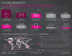 |
| Image Created by: (Latitude Research) http://www.flickr.com/people/37527143@N03/ |
*Permission granted for reuse by Standard YouTube
License.
No comments:
Post a Comment